OTC Guide app for iPhone and iPad
Developer: MDNG
First release : 29 Oct 2011
App size: 12.13 Mb
As the most accessible health care provider, pharmacists are in a unique position to help consumers make the most educated choices about which over-the-counter (OTC) products to use for the whole family. Pharmacy Times conducts the prestigious Survey of Pharmacists OTC Recommendations, now in its 15th year, to provide pharmacists and consumers with this valuable information. OTC Product Guide presents the results of this important survey in a searchable Web site of the OTC products most recommended by pharmacists. Organized in 14 different categories, you will find a wealth of information about key health issues and the OTC brands most often recommended by thousands ofPharmacy Times readers in this valuable resource.
Latest reviews of OTC Guide app for iPhone and iPad
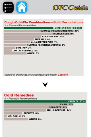
This app is a waste of space. Its simply a list of OTC categories, and when you click on one of the category choices, such as "cold sore remedies"...you get a pie chart indicating the apparent popularity of one OTC treatment over the others. But even that is my best guess as there is really no explanation to these endless, useless pie charts. I thought I was getting actual guidance on OTC products and their uses. There is a random panel of clinical information on the left panel of the screen but its completely random info, not anything searchable.
This app is completely useless. It does not even list the ingredients in common preparations. It just gives a pie graph of what sells the most and a brief write up on the side that talks about the disease state. The write up is so elementary that it is as useless as the pie graph. This is one of the worst excuses for a pharmacy app I have ever seen and they should be ashamed of themselves for marketing it to pharmacists.
So, assuming that this app is targeted at the retail pharmacist allows us to make certain assumptions about the knowledge base of the end user. Only such arrogance would allow for the extremely terse presentation of the various products involved in the treatment of a given disease state. Write-up of the disease state is nice, albeit cursory, and the treatment of the meds is a pie chart. In 2-D. And exactly what is the AWP of a pixel?
A Good review, hope to see more updates soon


